Friday, June 19, 2015

Week 4 & 5

This post will be a two in one since I forgot to write a post last week. So we're about half way through the program and I've certainly learned a lot. The past couple of weeks we spent looking into ways to simulate disease spread on our graphs. I made a nice basic simulator to model diseases. We've also made plans of how to further explore this subject as is pertains to our large graphs.

Disease Simulator

The big achievement I've made this week is creating our mini simulator so that we may begin studying how a disease will spread in these graphs. The simulator implements a basic SIR model. The SIR model stands for Susceptible, Infectious, and Recovered. Each of these represents a state that an agent can be in. When an agent is susceptible, they are healthy uninfected individuals. When a susceptible agent comes in contact with an infectious agent, there is a chance the agent will transition to the infectious state themselves. In the infectious state, an agent may infect other susceptible agents until their infectious period elapses. The infectious period is a pre-defined amount of time that an agent will remain infectious. At the end of this period, the agent will transition to the recovered state. In this state, they will no longer infect other agents, and they themselves can never be infected again. This state diagram can be represented as the following:

[ Susceptible ] -> [ Infectious ] -> [ Recovered ]

There are variations of this model where agents can be reinfected. Also we can add cases where an agent is a carrier, as in they carry the disease and infect others, but do not show symptoms. This is also represented by different infectious periods. We could also introduce vaccines, where some agents are much more immune to the infection and are therefore less likely to become infected. This simulation I have built only deals with the simple SIR model. However it can be expanded in the future without much issue.

The simulation runs in the following manner:

  • All agents start as susceptible
  • One agent is randomly selected as patient zero and becomes infectious
  • Loop for the duration of the simulation:
    • For each infected agent:
      • Try to infect each neighbor
      • If infectious period has elapsed, set state to recovered.

When the simulation is run, the user is asked to input some parameters for the experiment. The first is the infectious probability. This is a number between 0 and 1 that determines how likely an individual is to be infected. The next parameter is how long to run the simulation. This is an arbitrary time unit that you can imagine as days, weeks, months or whatever. The last parameter is the infectious period. Again this is how many time steps an agent will remain in the infectious state.

The program will take these parameters and run the simulation using the steps above. When it is done, it will dump the results into a file which we can use to display some nice charts in the web browser.

Now as nice as it would be to display the infection in real time visually, this is extremely difficult due to the complexity of these large graphs. Perhaps in the future I can display some very rudimentary visualization technique.

Results

So now that we have this simulation, we can run it on some of our graphs and begin to make assumptions about the data. Let's take a look at one I ran:

For this experiment, I chose a graph that was fairly evenly distributed. If you recall my last post, that means that most nodes had a good distribution of how many neighbors each had. I gave the infection a chance of 15% to infect another agent, set the duration for 500 time steps, and the infectious period for 8 timesteps. The chart on the left shows how many new infections appeared at each time step. This averaged around 450-500 infections per time step. The graph on the right shows how the population changed over time. If you look at the stats in the box, you can see that about 99.94% of the population was infected with the disease before everyone recovered. Remember this simulation is run without the assumption of any preventative measures. So think of it as no one washes their hands, and people are way too comfortable with each other.

So with this in mind, let's take a look at an example where agents are less connected. We can think of this as a case where people are more distant and don't connect with as many people on a day to day basis. However, still nobody washes their hands. (when will they learn?)

As we can see, this graph paints a bit of a different picture. Due to the nature of this graph I had to alter the parameters a bit to get some good data. Using the old parameters didn't change the outcome much. As we can see from this picture, we were only able to infect 83.13% of the population. The left chart shows us that by time step 12, we weren't infecting any new agents. However if you look at the right chart, you can clearly see people were still infectious at that time. From that data, we can make the assumption that the infectious individuals were not connected to any susceptible individuals.

Next Steps

Now that we have this small simulation, we want to begin looking at something called clusters in the graphs. This is where a group of nodes is more tightly connected with each other than other nodes. However these clusters (or communities) are also connected to each other usually by one or more nodes. As a real world example, think of it this way: I have a group of friends I hang out with at school. But I also have a group of friends I hang out with outside of school. I'm friends with all of these people in both groups, but my school friends are not friends with my non-school friends. What we would like to see is what happens when say one of my school friends gets sick and spreads it to our community and observe say how I could get sick then spread that infection to my non-school community. This can give us an idea of how these communities aid in the spread of disease throughout the greater area.

Friday, June 5, 2015

Week 3

Week 3 is done. And I think I've learned a lot this week. Probably everything I ever wanted to know about big graphs. But there's still more to learn in that area. This week was mainly spent analyzing large graph files given to me by Dr. Mikler. There was a lot of data to look through and it definitely gave me a better insight as to how this data can be processed and utilized. So let's take a look at what we did.

Analyzing Large Graphs

Dr. Mikler comes in and dumps these large files on us that contain HUGE graphs. So the first thing we need to do is figure out a way to read these files. Each file had thousands of lines of node pairs. They corresponded to the edges of the graph in the following format:

sourceNode destinationNode weight

This made it rather simple to write a program to read in the data. I made a small data structure that would essentially build an adjacency list in memory. An adjacency list is a way of representing a graph by first declaring a node followed by each node connected to that node. For instance the following adjacency list:

1 2 3
2 1 4
3 1
4 2

Would represent this graph:

Now think of this on the scale of thousands of nodes. Reading this data into the program from the file takes the longest by far. This is due to I/O constraints from the OS we're running on. We could parallelize this part, but that gets complicated due to calculating positions in the file. Once we get this data into the data structure, we can do all kinds of things with it to calculate different statistics. And thanks to parallelization, we can drastically cut down the time this takes.

The first piece of data we get is the number of nodes in the graph. This is valuable because with this number, we can split up the work equally amongst our threads to perform other calculations. Most importantly, we can start looking into statistics relating to the degree of the nodes. The degree is the number of connected, or adjacent nodes to a given node. For example, if a node has 3 nodes adjacent to it, it is said to have a degree of 3. This data can tell us how dense a graph is. The more dense, the shorter the distance you are likely to travel from one node to another that is more than one node away. By sorting through our graph data structure, we can see the highest degree a node might have, the lowest degree, and the average degree. This paints part of the picture of how these graphs may look.

Visualizing this distribution

Nothing tells you information like a picture. Or more specifically a graph (This time I mean a line graph. Let's call it a chart). Printing out the numbers from the program discussed above gave us some information. But we'd really like to see the whole picture of the degree distribution. This helps us see how dense the graph really is, as well as a better idea of how many nodes are connected. I had the program count the degrees of each node and store how many nodes had a certain degree. This data was dumped into another file. I wrote a quick web page which would display the data on a line chart so we could see the distribution of degrees. Ideally we'd like to see a bell curve on this chart to indicate an equal distribution. Some graphs had that:

Other graphs were slightly less uniform:

On the x axis you can see the "degree", how many nodes connected to a given node. On the y axis is the number of nodes in the analyzed graph that have that given degree. In the first example, the most common degree in the graph was 10. 12,180 nodes shared that degree. Which means there were 12,180 nodes that were each connected to 10 other nodes. In the second example, while not as uniform in distribution, the graph shows to be more dense. We can see the most common degree is 88, which is significantly higher than the previous graph. This is likely due to the larger number of edges. The second graph contains 3.3 million edges compared to 500,000 in the first graph.

Using this tool we can get an idea of the overall density of these large graphs. This will help us to craft solutions for processing these graphs for whatever purpose we may have. One way is using these graphs to represent a network of agents and observing how an infection could spread through these graphs. My hypothesis is with high densities like these, it will travel very fast through the network.

Friday, May 29, 2015

Week 2

The plot thickens...

So here we are at the end of the second week of the program. To recap a bit, we are looking at ways to model disease spread over large geographical areas. We'll be using a cluster to parallelize the algorithm in order to run our simulation in a more efficient manner. So with that knowledge, let's discuss this a bit further.

Cluster Computing

Let me discuss this topic a bit more in detail to explain what I mean when I say things like "cluster" and "cluster computing". A cluster is generally several computers networked together working towards a single goal. This can involve 2 computers or thousands. In the latter case, these tend to be defined as supercomputers. In my last post, I detailed the specs of our cluster we use in the lab. This becomes extremely useful when working with large sets of data. We can spit up the work across all of our machines (nodes) in order to exponentially speed up our work. Think of it this way: If a single construction worker tried to build a house, it would take a very long time. However, if we add several workers to the job, they can split the duties and complete the house much faster than a single worker. In computer science, we take algorithms that can take a long time, and try to find ways to split the work into multiple tasks that can be worked on simultaneously.

Large Graphs

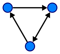
For the problem we are trying to solve, we end up having to use graphs to store a lot of our data. We aren't talking about bar graphs or line charts. These are a data structure in computer science which involve a set of vertices connected by a set of edges. For example:

This is a graph with 3 vertices (nodes)

Now the example presented above is a relatively small graph. The graphs we will be using in our simulation will consist of thousands (possibly millions) of nodes. This is because we will be using a graph to represent various locations in our geographical area. Each node can contain a number of agents in which we must process and determine any health changes as well as determine the agent's next possible location.

For a given node, we will need to examine the adjacent nodes to determine if a given agent should travel to that particular node. Even further than that, a given agent may need to travel to a node which is several nodes away from its current location. This could be due to parameters such as age (agent is traveling to school) or financial classification (expensive housing is located further away). In this situation, we will need to find a path (more specifically the best path) to the agent's desired location. Many algorithms exist for this situation. We will be utilizing Breadth First Search (BFS) as it will provide an adequate solution for our case. With such a large graph this can take a long time. This is because the algorithm examines each adjacent node, then it looks at each adjacent node to those, and each adjacent to those, and so on and so on. This adds up not only as our graph grows large, but also with the number of agents this must be performed for.

Enter cluster computing

So obviously we have a problem that will hinder our simulation's performance immensely. Thankfully, there are a few ways we can parallelize this problem to take advantage of our cluster's computing power. First, we can split up our graph into sub areas. Think of this like different areas of your city, taking Fort Worth as an example, we could section it into the Hulen area, Ridgmar, Downtown, and so on. We can then assign the areas to an individual processor. So on our cluster, we could section our geographical area into 16 sub areas (8 machines, 2 processors each). Any more than this and we risk hurting our performance more than we can boost it. Now we have 16 smaller graphs that are more manageable and a bit easier to traverse. Now we still have a problem where path finding could take a while especially at one node at a time. One thing we could do is modify our BFS algorithm to be a bit similar to the A* search algorithm. Since we will have a known distance between each node, which is called a weight, we can use this to help determine if the nodes we are searching are getting us closer to our destination or further away. Additionally, we can utilize the multiple cores on our processor to examine several nodes simultaneously to speed up the process of finding a path.

This simulation will grow very complicated, very quickly. Therefore, we will need to be careful writing the algorithm to keep from breaking things or causing our code to become ugly and messy. Smaller sub-experiments should be utilized to ensure parts of the algorithm will behave the way we expect.

Software Testing

Dr. Mikler has returned this week, so we've had some time to discuss plans for the summer. Rather than focus on the software testing of the cluster, he has asked me to develop a testing solution for the ACM Abstract Repository website, where students may submit abstracts for papers they are writing for peer review. I was just recently given access to this code so I am in the process of examining the code to find points of potential failure. Once I have a complete idea of the functionality of the site, I can begin developing tools to test parts of the site to ensure the code will not fail when presented with various types of input. I plan to research and utilize PHP unit testing tools to aid in this task.

We have discovered much this week. Stay tuned, and we just might see some mini experiments next week.

Friday, May 22, 2015

Week 1

First week of the REU has gone fairly smoothly I believe. Getting settled in and figuring out what I want to do has been fun. We started the week by getting to know everyone and showing the out of town students around downtown Denton. This was a good time and I think everyone had fun checking out some of the cool places around the square.

Dr. Mikler (my faculty sponsor) had been out of town this week so Dr. O'Neil has been helping me find some topics to research and finding a place to get started. Which leads us to our next topic.

Computational Epidemiology

Let's start by talking about this lab and what we do. We are the Computational Epidemiology Research Laboratory (CERL). The lab applies Computer Science techniques to epidemiology in order to provide better ways of modeling data and studying the spread of diseases. One particularly useful part of this subject is simulating the way a disease can spread through a given population. For example, a simulation can be created where a given number of people in a population have the flu. Using a mathematical data model known as the SEIR model (Susceptible, Exposed, Infected, Recovered), we can simulate the way this disease is transmitted through the public. We can control different parameters such as the starting number of infected, how likely a person is to be infected, how long the person is in the exposed state before transforming into infected and being able to infect others, and how likely a person is to recover from the infection. So we'll input these parameters, run the simulation for some amount of time and examine the results. The results will show us how many people were infected, how fast the infection spread, and how many people were able to recover. This data is very useful to health officials as they can use it to prepare for a possible pandemic. It will give them an insight to how this disease will spread and help them to plan prevention measures.

My Research

Before I talk about what I plan to research regarding this topic, let me take a step back. Part of my duties in the lab are restoring our cluster back to full functionality. Our cluster consists of 8 nodes, each with 2 quad core processors and 32GB of RAM a piece. This allows us to do some serious processing. This week I spent some time writing user management scripts so that we could add people on to the cluster easily for other members of the lab to use it. Now that these are in place, the cluster is in a usable state.

So with this in mind, what I would like to do is expand upon the simulation I discussed in the previous section. Current implementations of this type of simulation tend to focus on smaller population areas, like a concert or a festival. I believe this could be expanded into a larger population area such as a large city like Fort Worth or Dallas. When you scale things up to this magnitude, single processors would take an extremely long time to simulate something like this. This is where our cluster comes in. We can utilize the greater number of processors and large amount of RAM to scale the simulation up to potentially millions of individuals. This would speed up simulation time and allow us to analyze larger geographical areas more efficiently. We could also add more parameters to get more comprehensive data. If we add variables like income ranges and age ranges, we can see the way the disease affects different parts of the population.

Software Testing

With an application like this, we will need an effective way to test it. Currently there aren't readily available solutions for testing parallel applications such as this. So as I develop this simulation, I will be researching an developing a solution for Unit Testing or a similar testing method for cluster computing applications. This is a difficult subject because you have any number of processes running across the cluster and you need a way to examine them all to be sure they are providing correct results.

This is all pending approval by Dr. Mikler on his return.